
For well over a decade Melbourne has been ranked as one of the most liveable cities in the world. For humans these rankings scores are based on the quality of life created by healthcare, infrastructure and the environment. But how would Melbourne be ranked when viewed from a dog’s perspective? The Map of the Month […]
Category Archives: Map of the Month

23
Jun
Jun
While most of us are sleeping night-shift workers are keeping our cities running. They work as healthcare professionals, emergency responders, public transport operators, cleaners, hospitality staff. And they’re the ones making sure our hospitals function, our streets are safe and that our essential services are available. They also play in important role in making sure […]

11
Jun
Jun
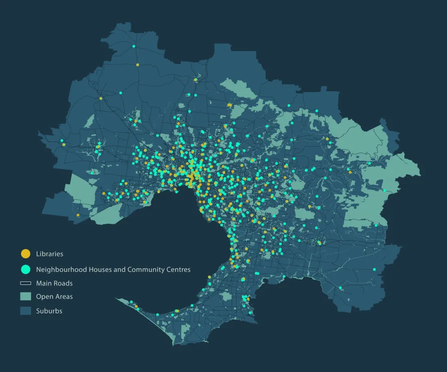
The 20-minute neighbourhood is a concept that evolved from the idea of the 15-minute city. The idea is that almost anything you need to access on a day-to-day basis—work, shopping, education, childcare, health services, green spaces and entertainment—should be within a 20 minute walk or bike ride from your house. 20-minute neighbourhoods feature in many […]

08
May
May
The latest Map of the Month, by project leaders Dr Thami Croeser (RMIT University) and Professor Michele Acuto (University of Melbourne), focuses on the impact of asphalt and concrete on urban heat islands, a phenomena which causes urban areas to be 4-10 degrees hotter than rural areas. With global temperatures continuing to rise, finding a […]
08
Apr
Apr
We’re so happy to be part of the Map of the Month initiative—a science communications project led by the University of Melbourne, in collaboration with AURIN, Melbourne Centre for Cities, Melbourne Data Analytics Platform, and Pursuit. The goal of the project is to use maps as a tool to initiate important policy discussion within Metropolitan […]